
What changes, and what the menu looks like
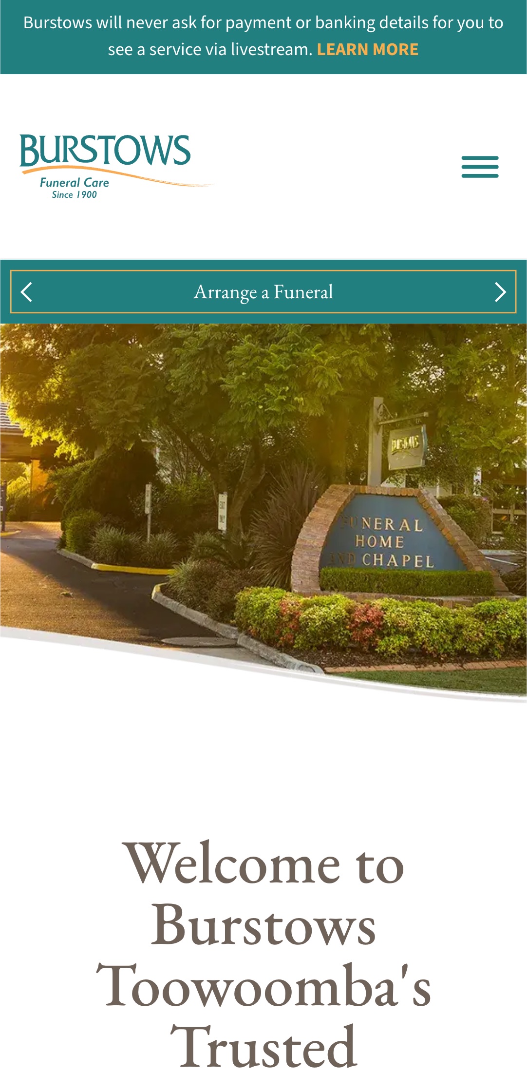
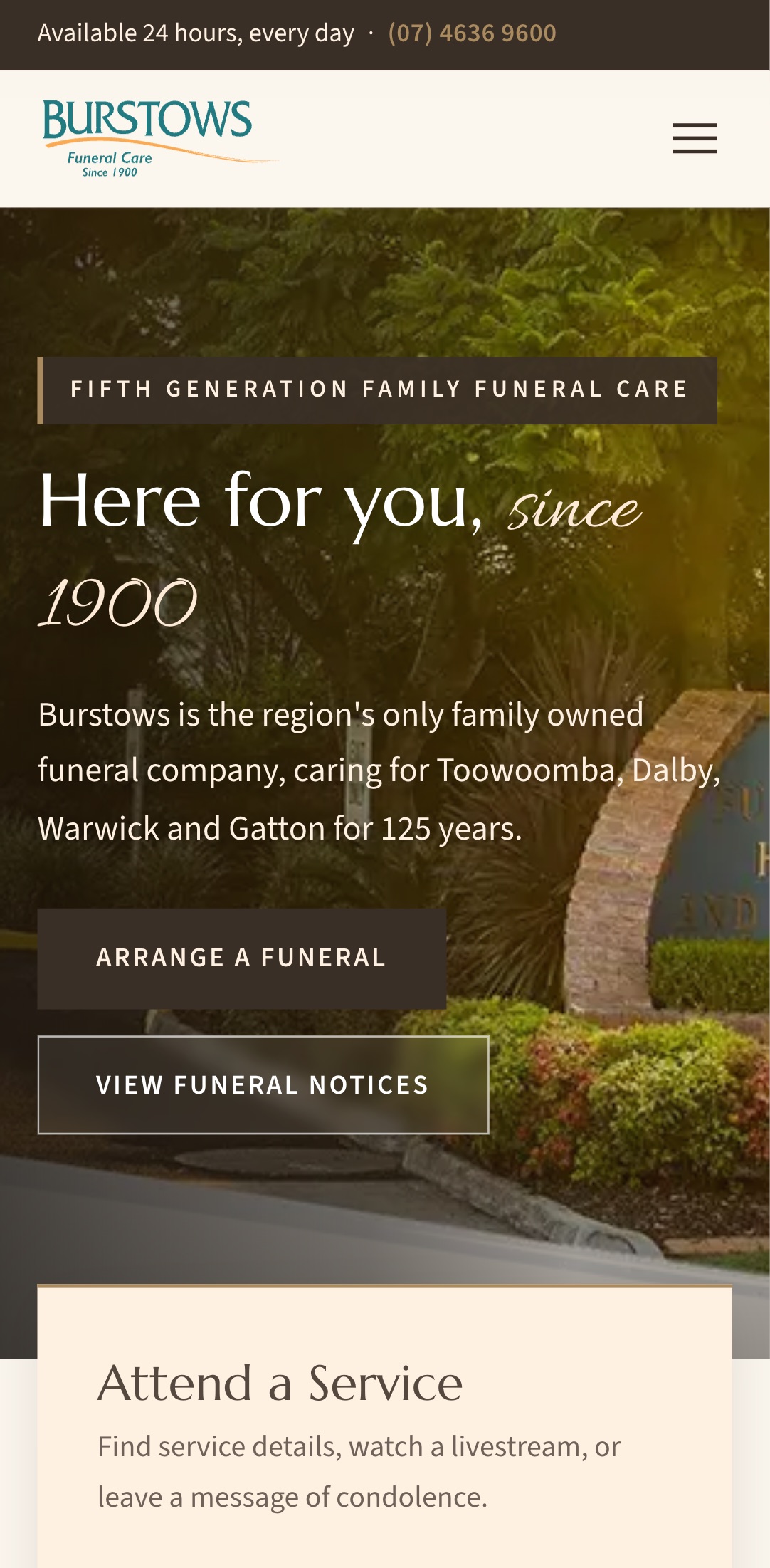
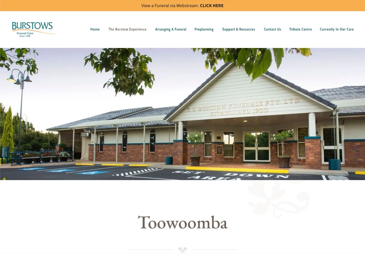
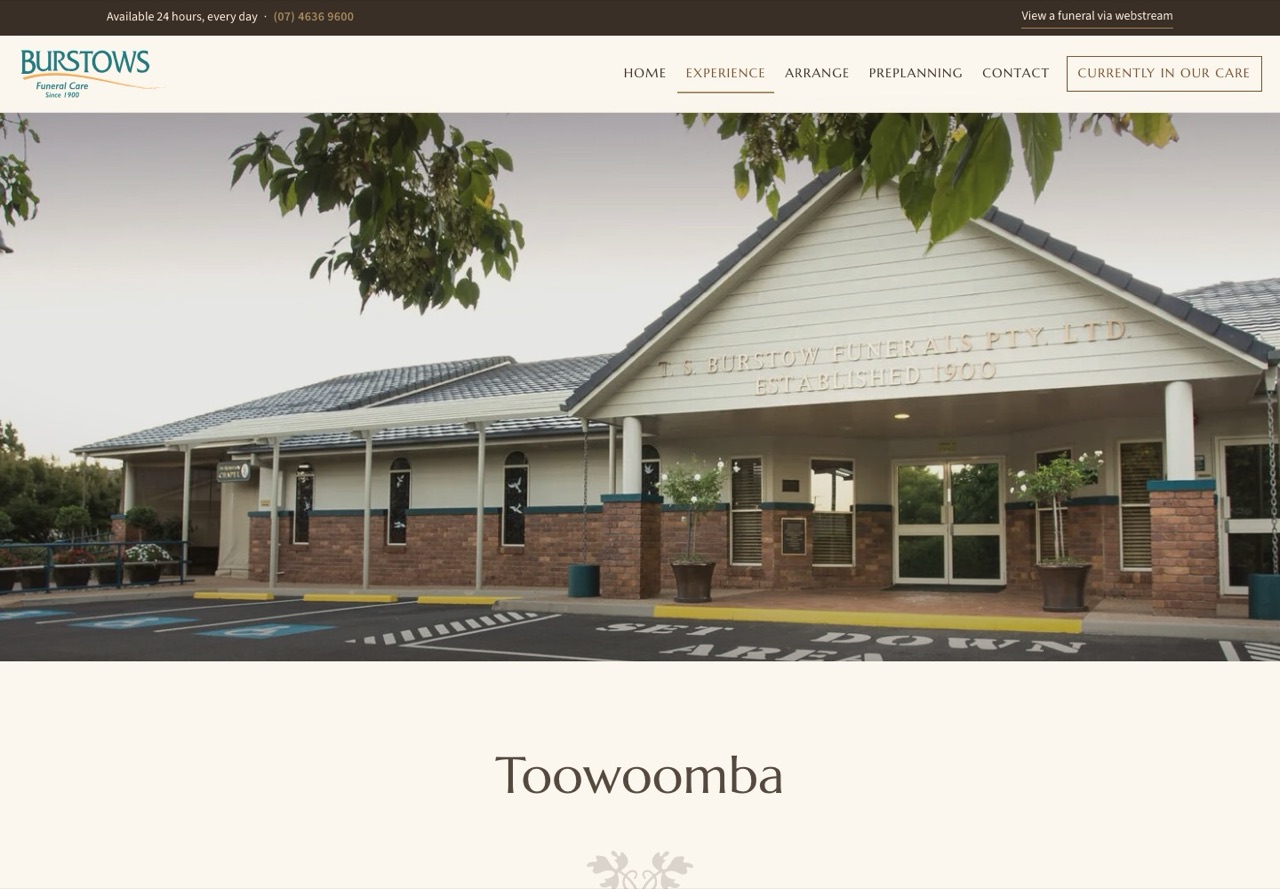
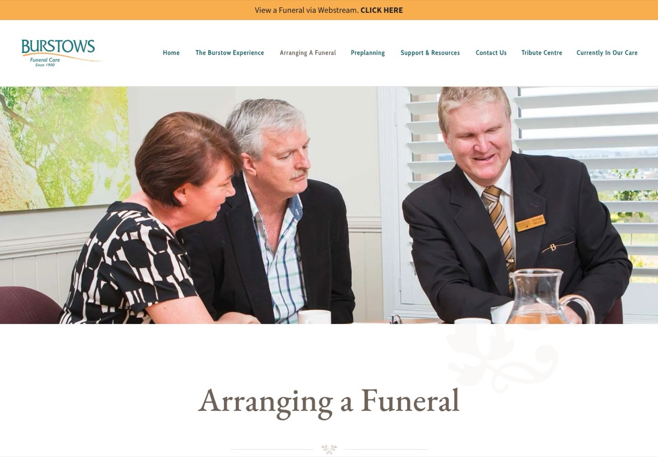
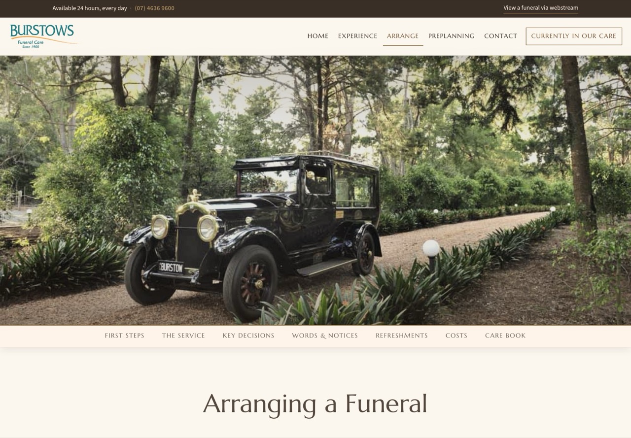
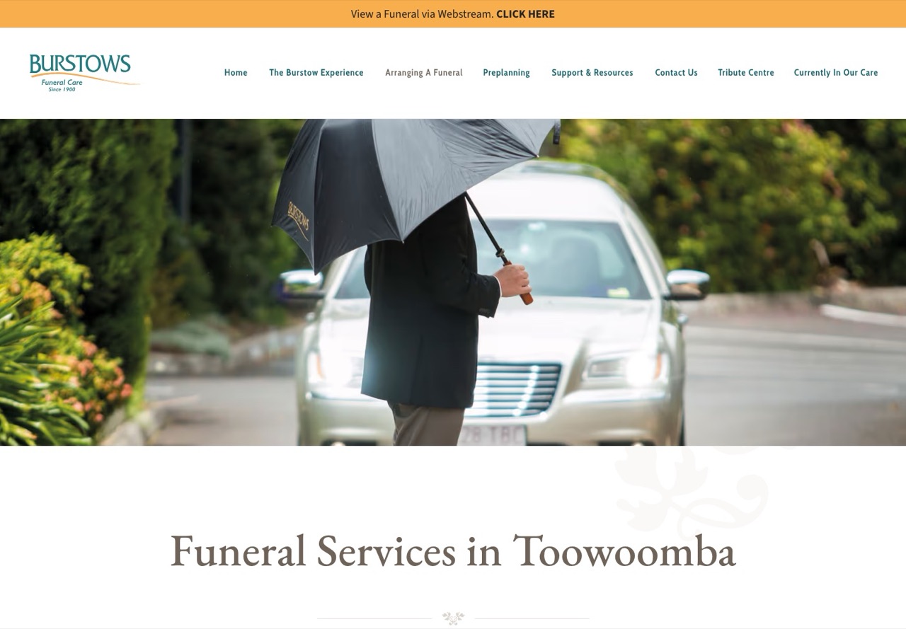
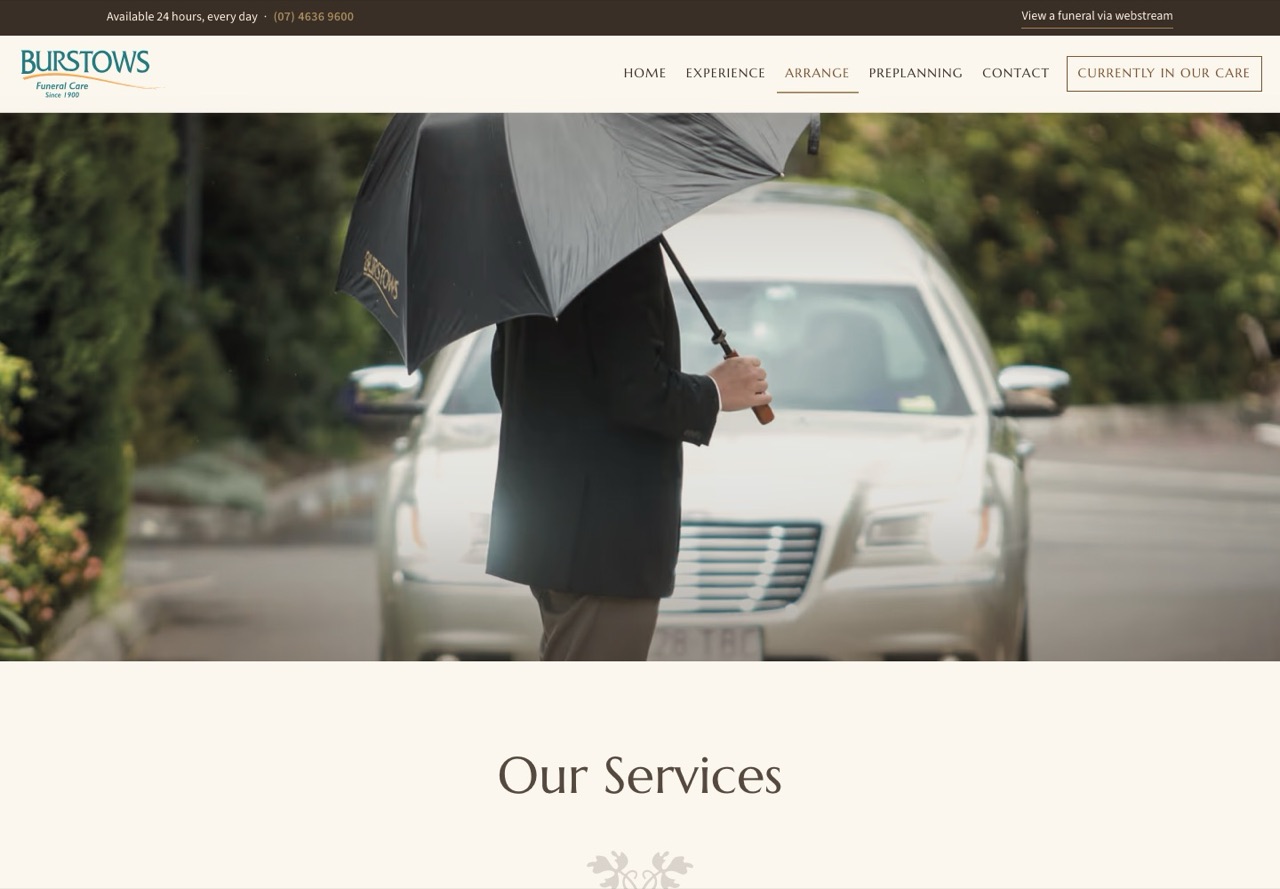
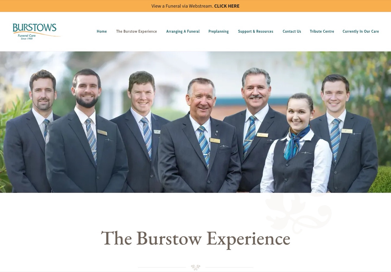
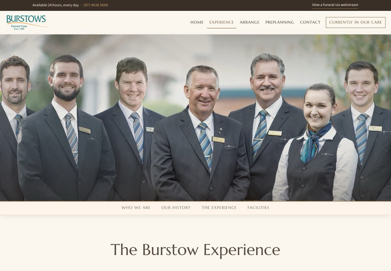
Before we come to the families' pages, ten things changed for the families who visit, the media team who look after it and the business that owns it. The picture beside each one is the current site on the left and the new site on the right.
The menu, before and after
A family in the first hours after a death is not browsing a menu. They need one of three things: to arrange, to see who is in care, or the phone number. The new menu is built around that, and it went from eight items and four menu lists to six items and one button.
Today
- Home
- The Burstow Experience ▾
- The Burstow Philosophy
- Our History Since 1900
- Facilities
- Our Services
- Arranging a Funeral ▾
- Our Services
- Preplanning
- Support & Resources ▾
- News
- Burstows Puzzle Book
- Contact Us ▾
- Employment Opportunities at Burstows
- Gifting Back
- Tribute Centre
- Currently In Our Care
The new site
- Home
- Experience
- Who We Are · Our History · The Experience · Facilities
- Arrange
- First Steps · The Service · Key Decisions · Words & Notices · Refreshments · Costs
- Care Book
- Preplanning
- A Talk of a Lifetime · Planning Ahead · Guides & Downloads · Sit Down With Us
- Contact
- Tributes
The indented items are a bar on the page itself that stays in view as you scroll. Nothing on the new site drops down from the menu.
Why it changed
The current menu lists Our Services twice, under The Burstow Experience and again under Arranging a Funeral, and it puts the Philosophy beside the Facilities as if they were the same kind of thing. Tribute Centre and Currently In Our Care are the last two items in the row.
The new menu names the job in one word. Experience is for who Burstows are, Arrange is for a family who needs to act, and Preplanning is for one who wants to think ahead. Then there are Contact and Tributes, and Currently in Our Care as a button that stands apart, because it is the most visited page on the whole site, with 83,050 clicks from Google in the three months to 01/09/2026. The phone number and the webstream link sit above the menu on every page, at every screen size.
What left the menu did not leave the site. News, Support and Resources, the Puzzle Book, Employment, Gifting Back, the four homes and the Funeral Pricing Information all live at the foot of every page, and each keeps its own address.
Tributes has its own place in the menu. Google sent people to the Tribute Centre 15,156 times in those three months, and the words "burstows tribute centre" on their own were clicked 6,641 times, so families are asking for it by name. Currently in Our Care also carries a button straight to it, for someone looking for a service that has already been held.
On a phone
Most visitors arrive on a phone. The new site opens the same six items and the Currently in Our Care button from one menu button, with the phone number as the last item so it is always one tap away.

1. Four homes, four proper pages
Toowoomba, Dalby, Warwick and Gatton each get a page of their own with a contact card, a map, a photo gallery and the facilities at that home. Today they are four items in a menu list of sixteen. Warwick's page was clicked 641 times and Dalby's 625 times in three months from Google alone, so these are the pages a family in those towns lands on first.
2. Arranging a funeral as one walk
Fifteen guides, from Before Meeting the Funeral Director through to Settling Funeral Expenses, used to be fifteen separate pages. They are now one page with six stages, a bar that stays in view as you scroll, and the Complete Care Book beside them. Every old address still works and lands on the right stage.
3. Services that photograph well
There are thirteen services, each with its own page and photograph, and each can be reached in one click rather than through two different menus. Bereavement Support, Webstreaming and the Crematorium each keep their own address, because each one is searched for on its own.
4. Recruitment that files itself
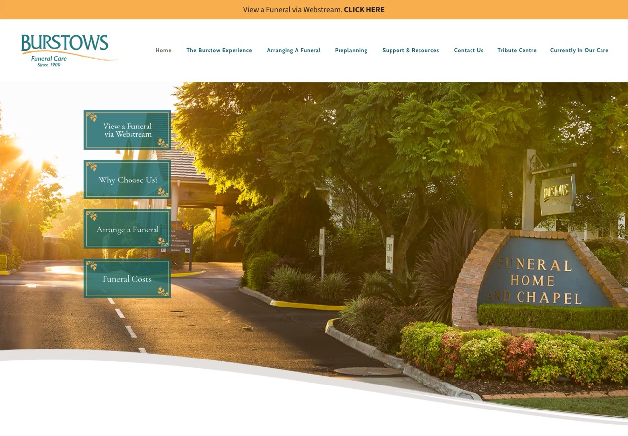
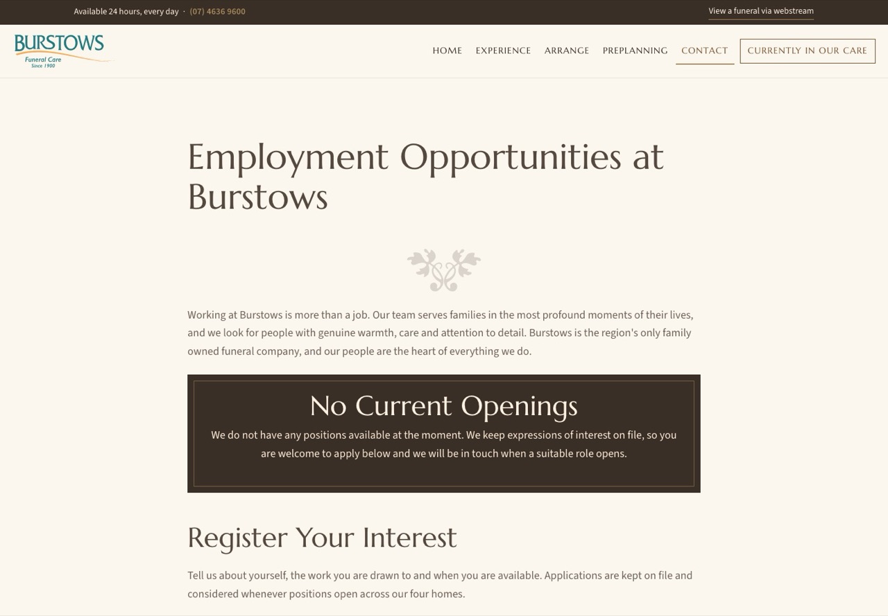
The employment address opens a real employment page. The new page lists open positions, each with a simple on and off switch, and the application form will save each candidate into the recruitment records rather than an inbox: their name, the positions they are interested in, preferred location, full time or part time or casual, availability, earliest start date, why Burstows, and their CV. This is what your team asked for. The record for it is made and waiting; the form is connected to it before launch, and the team will then sort applications as new, shortlisted, interviewed, on file or declined.
5. Preplanning that invites a conversation
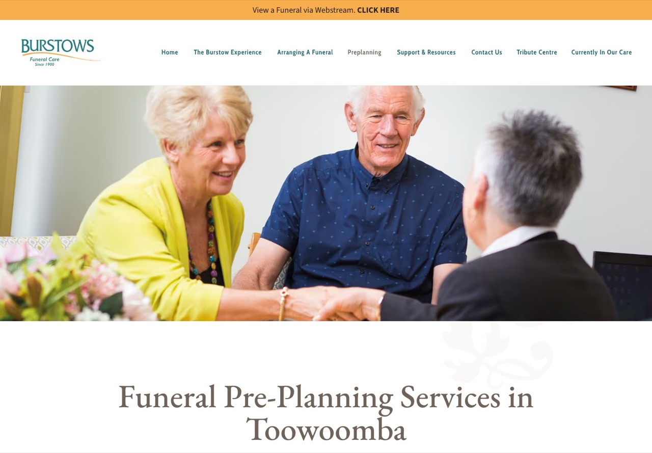
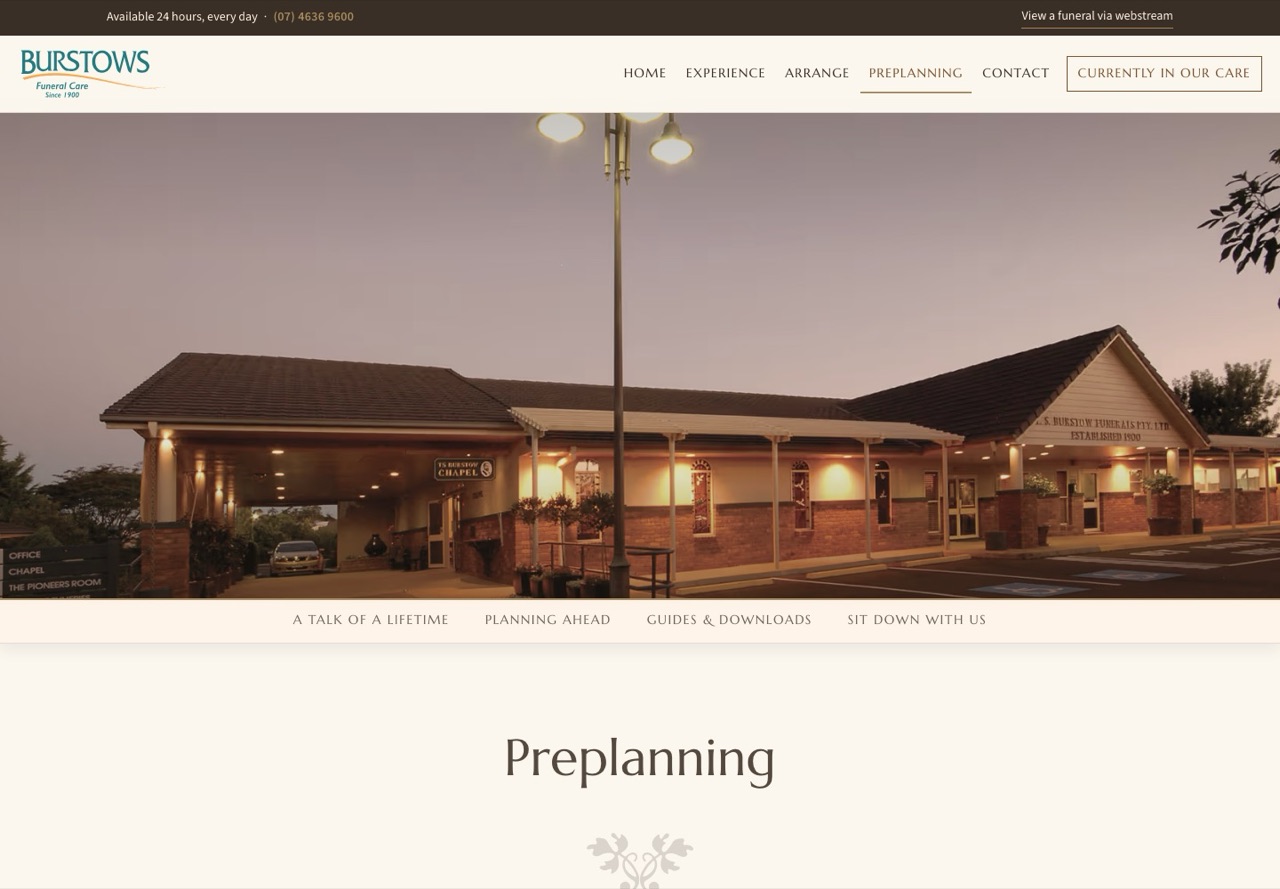
The preplanning page now reads in four parts: A Talk of a Lifetime, Planning Ahead, Guides and Downloads, and Sit Down With Us. The guides sit behind a simple email address, so the team knows who has taken one, and the page ends with an invitation to visit rather than a form.
6. Contact without the clutter
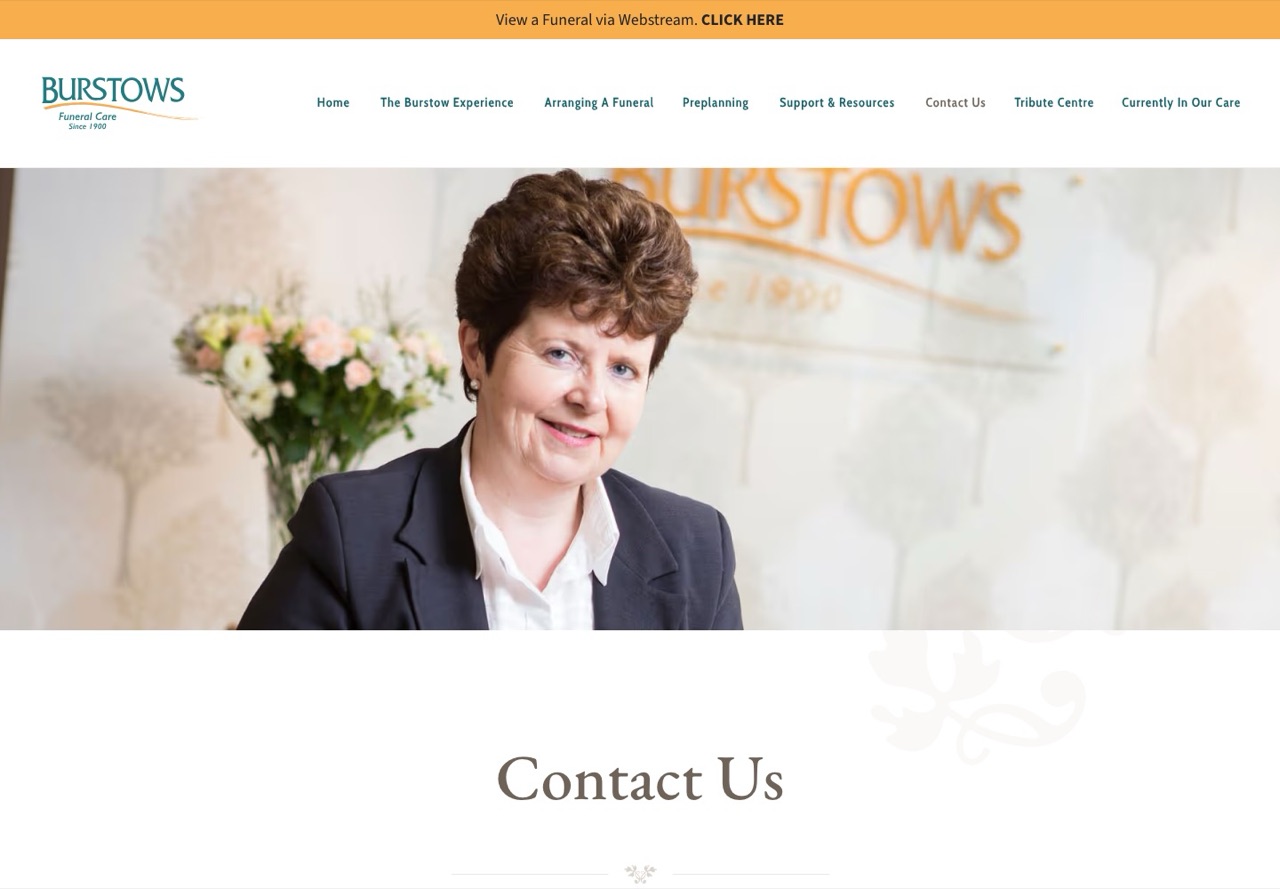
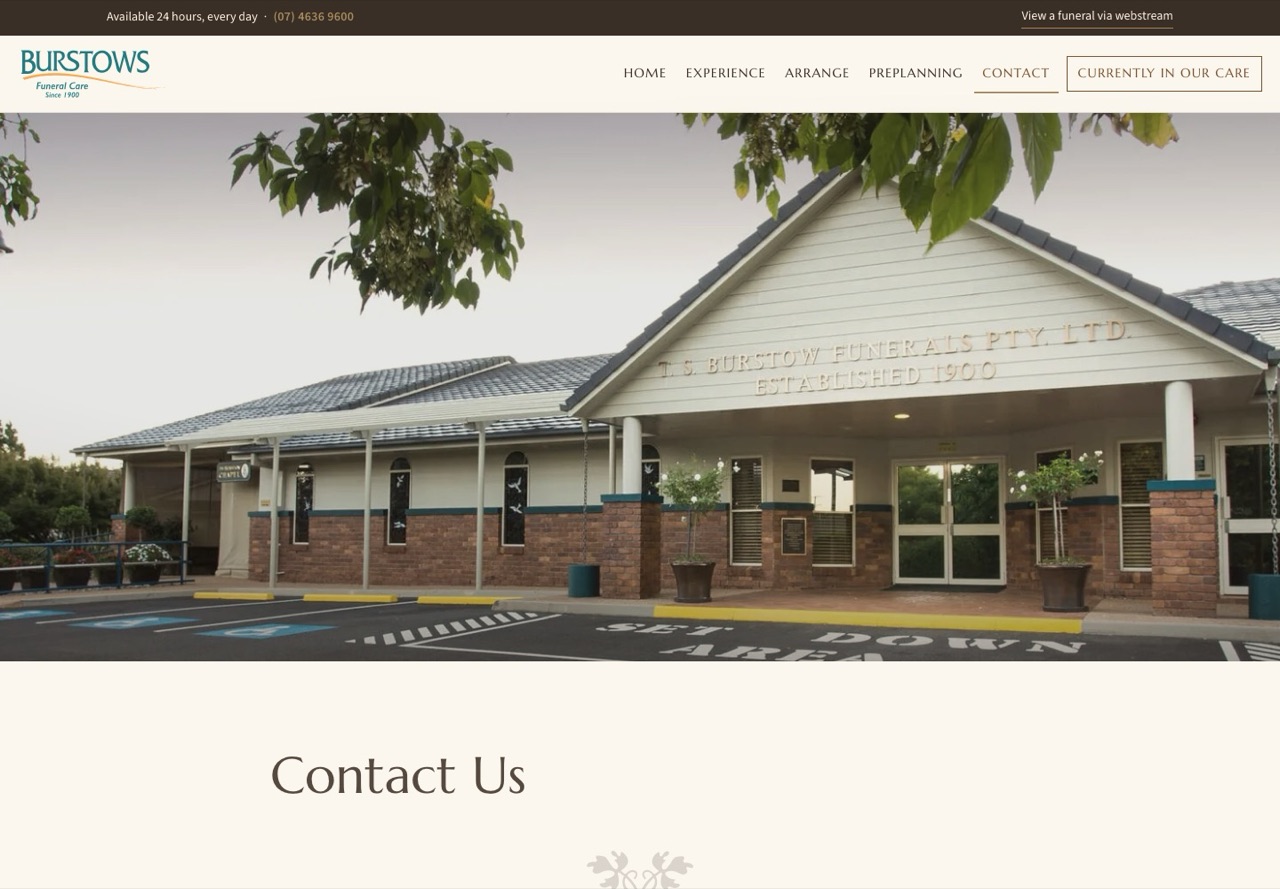
The page carries the four homes, the phone number, the after hours line and the form, with Employment and Gifting Back a link away rather than tucked inside a menu list.
7. News the team can publish
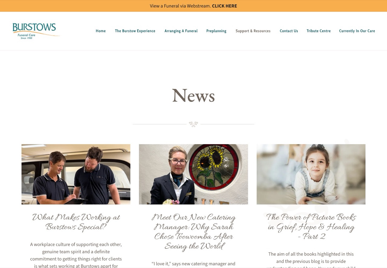
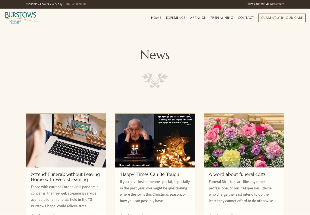
All 26 posts came across with their photographs. A new post is a title, a date, a picture and the words, not a page to be built, and posts are on the site a few minutes after they are published, once administration is on.
8. The Burstow Experience in one place
The Philosophy, the History since 1900 and the Facilities were three pages under one menu list. They are now one page in four parts: Who We Are, Our History as a timeline of the generations, The Experience, and Facilities. The old addresses land on the right part.
9. The paperwork lives with you
Every PDF on the site, including the Funeral Pricing Information a family downloads from the foot of the page, is now on burstows.com.au. Today those files sit with the company the current website is built with, at that company's addresses, and they would disappear with the account.
10. Speed, side by side
Google's speed test loads a page the way an ordinary phone on a slow connection would, and reports eighteen measures. We ran it 3 times on each homepage on 02/09/2026 and took the middle result of each, so one lucky or unlucky run cannot tip the table. Here are the six that matter most to a family waiting for the page. The two scores are out of 100 and higher is better, and for the other four lower is better.
| Measure | Current site | New site |
|---|---|---|
| Performance score | 64 | 97 |
| Accessibility score | 96 | 100 |
| First words on screen | 4.3 s | 1.7 s |
| Main picture or heading on screen | 9.0 s | 2.3 s |
| Separate files downloaded | 66 | 27 |
| Building blocks on the page | 609 | 168 |
Of the eighteen, the new site is ahead on fifteen and level on one, and on two the current site is slightly better: the page is frozen for 46 thousandths of a second against 68 while it loads, and its worst delay in answering a tap is 111 thousandths against 140. Both are under a sixth of a second, and the full eighteen are kept on file for Rory.