
What Burstows gets
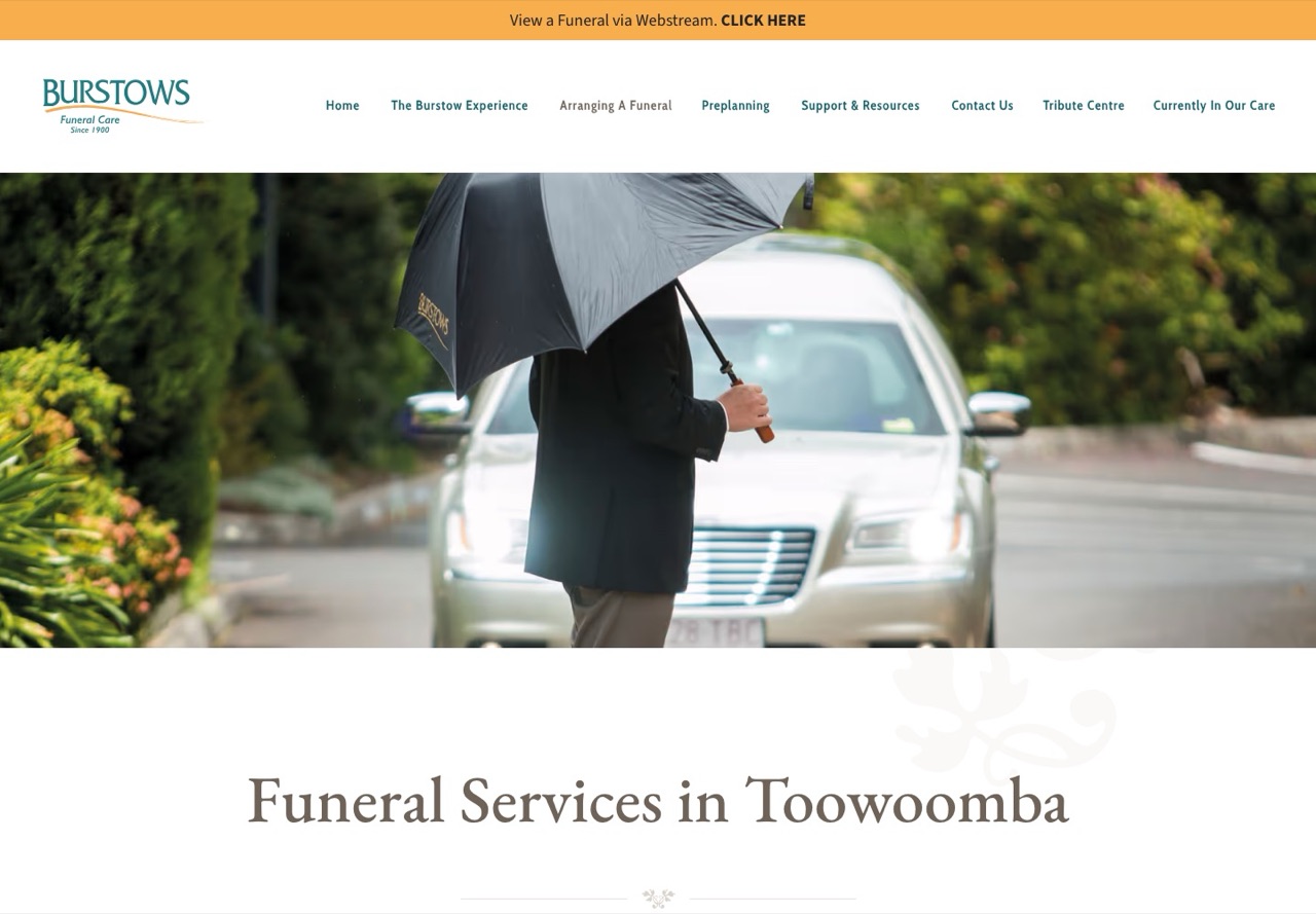
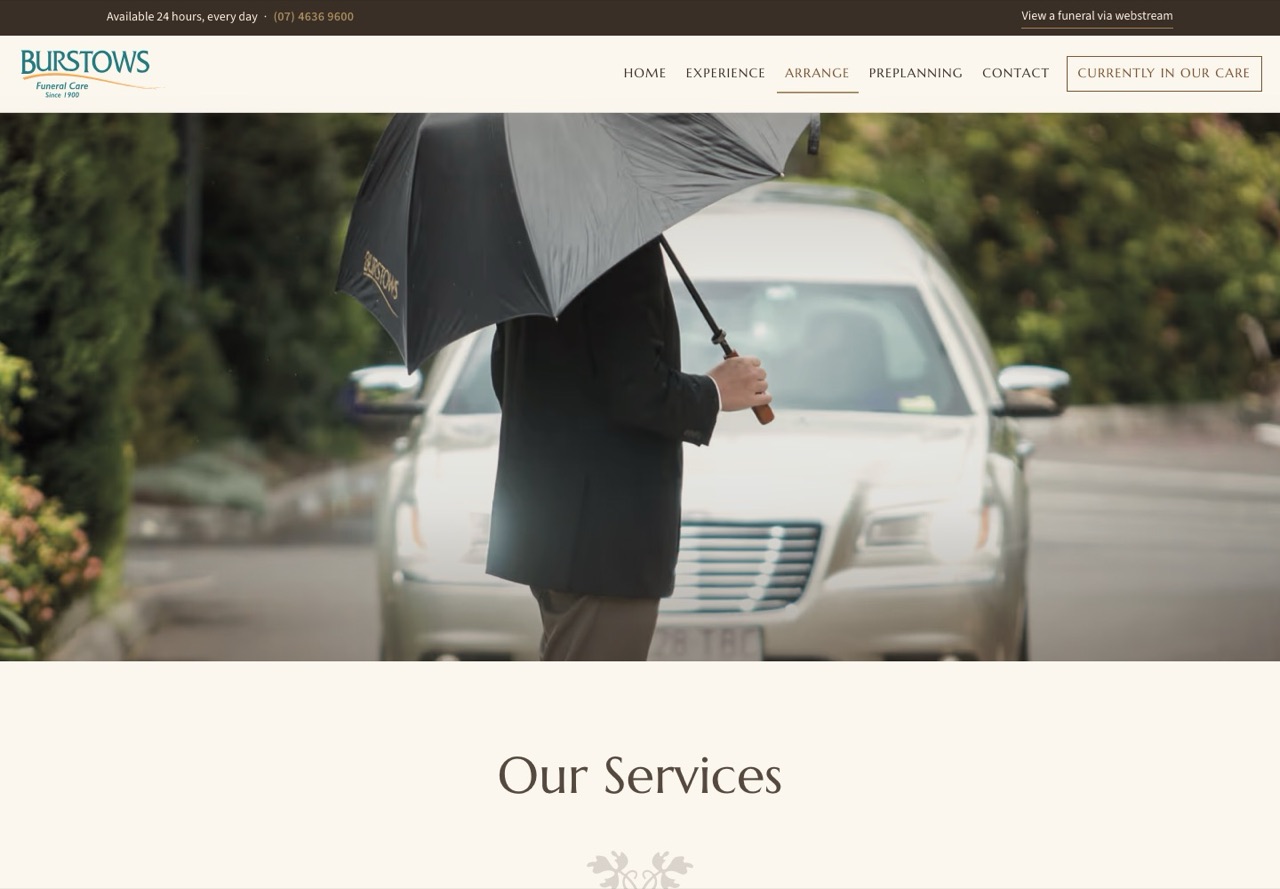
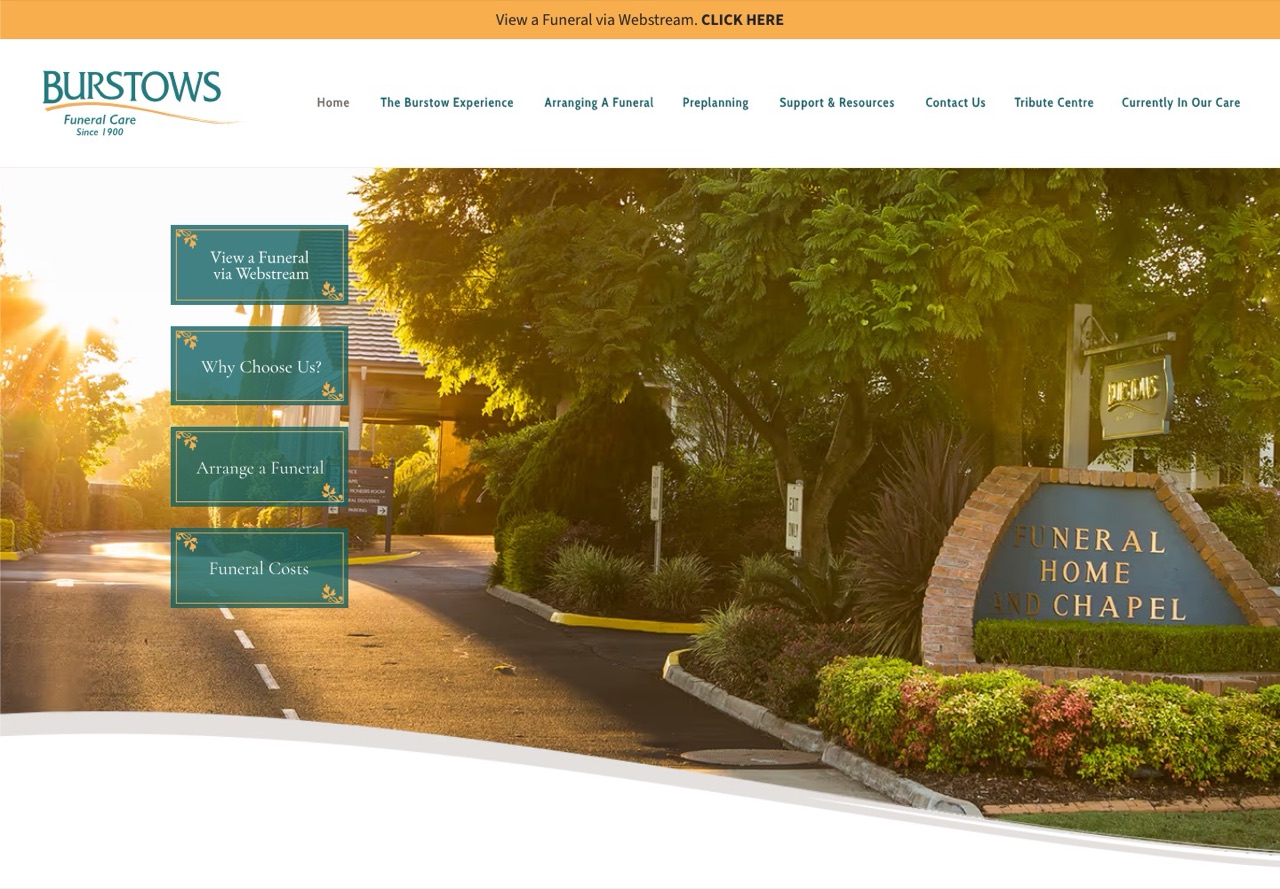
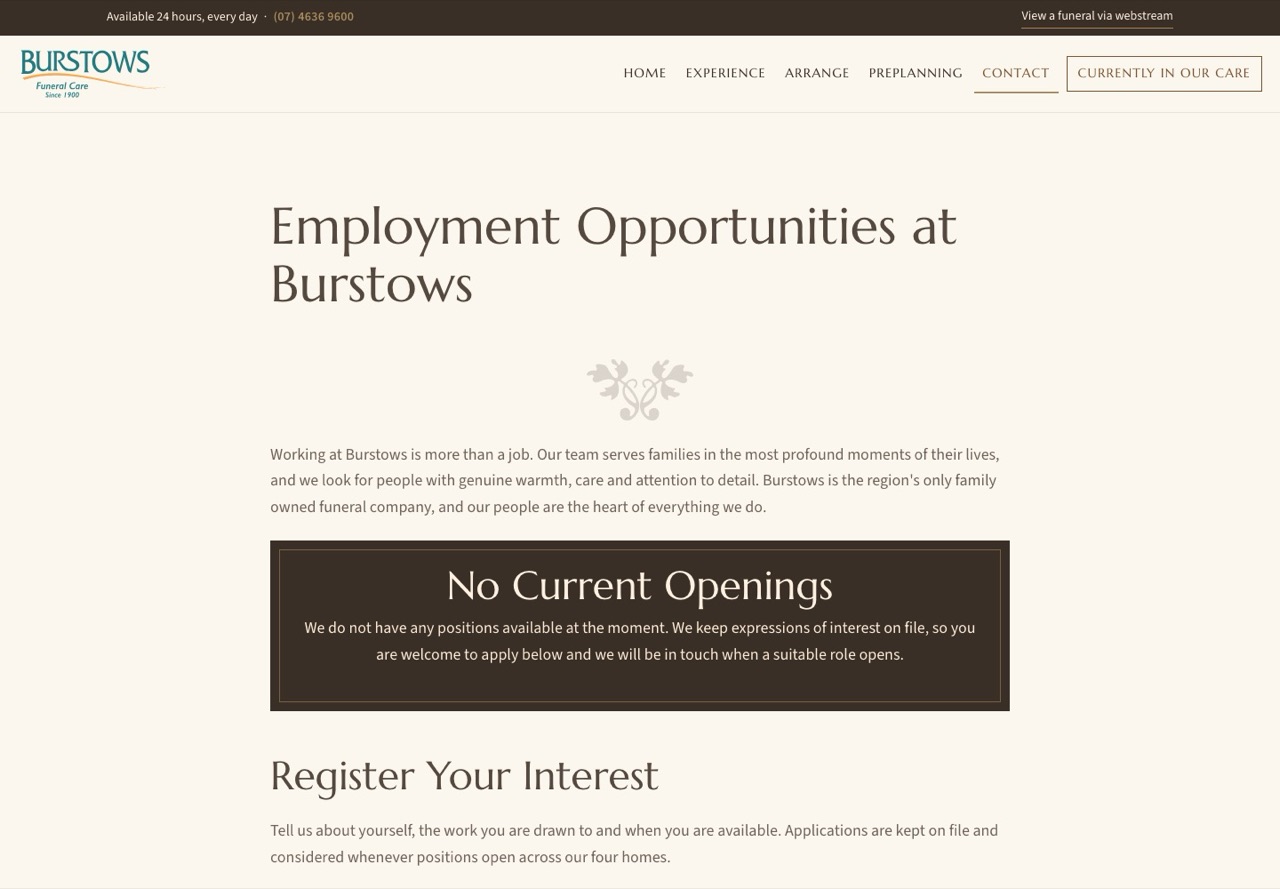
Eleven things that change for the families who visit, the media team who look after it, and the business that owns it. The picture beside each one is the current site on the left and the new site on the right.
Four homes, four proper pages
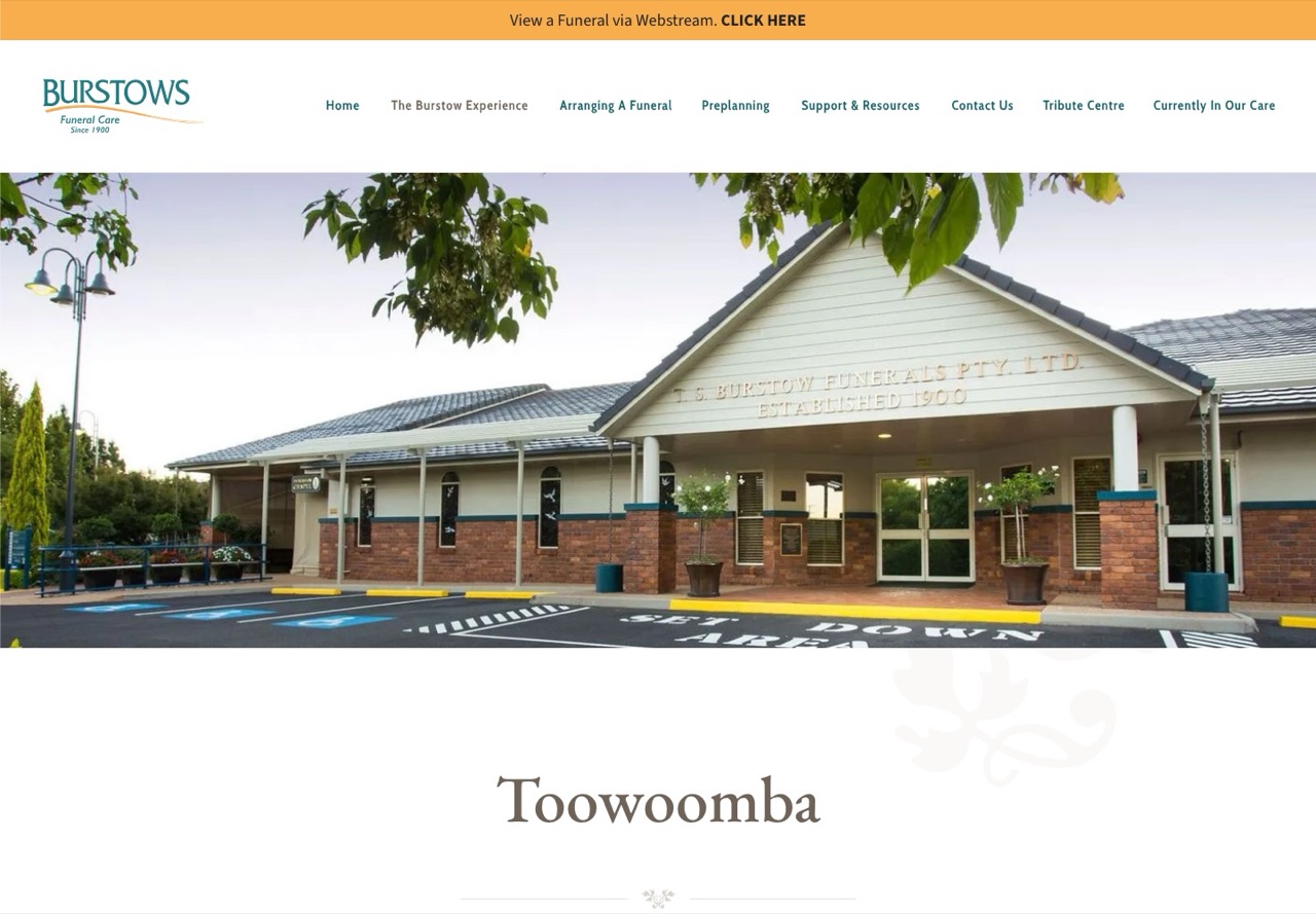
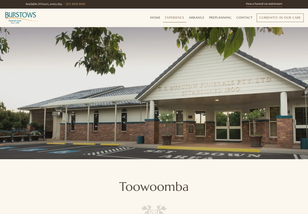
Toowoomba, Dalby, Warwick and Gatton each get a page of their own with a contact card, a map, a photo gallery and the facilities at that home. Today they are four items in a dropdown of sixteen. Warwick's page was clicked 641 times and Dalby's 625 times in three months from Google alone, so these are the pages a family in those towns lands on first.
Arranging a funeral as one walk
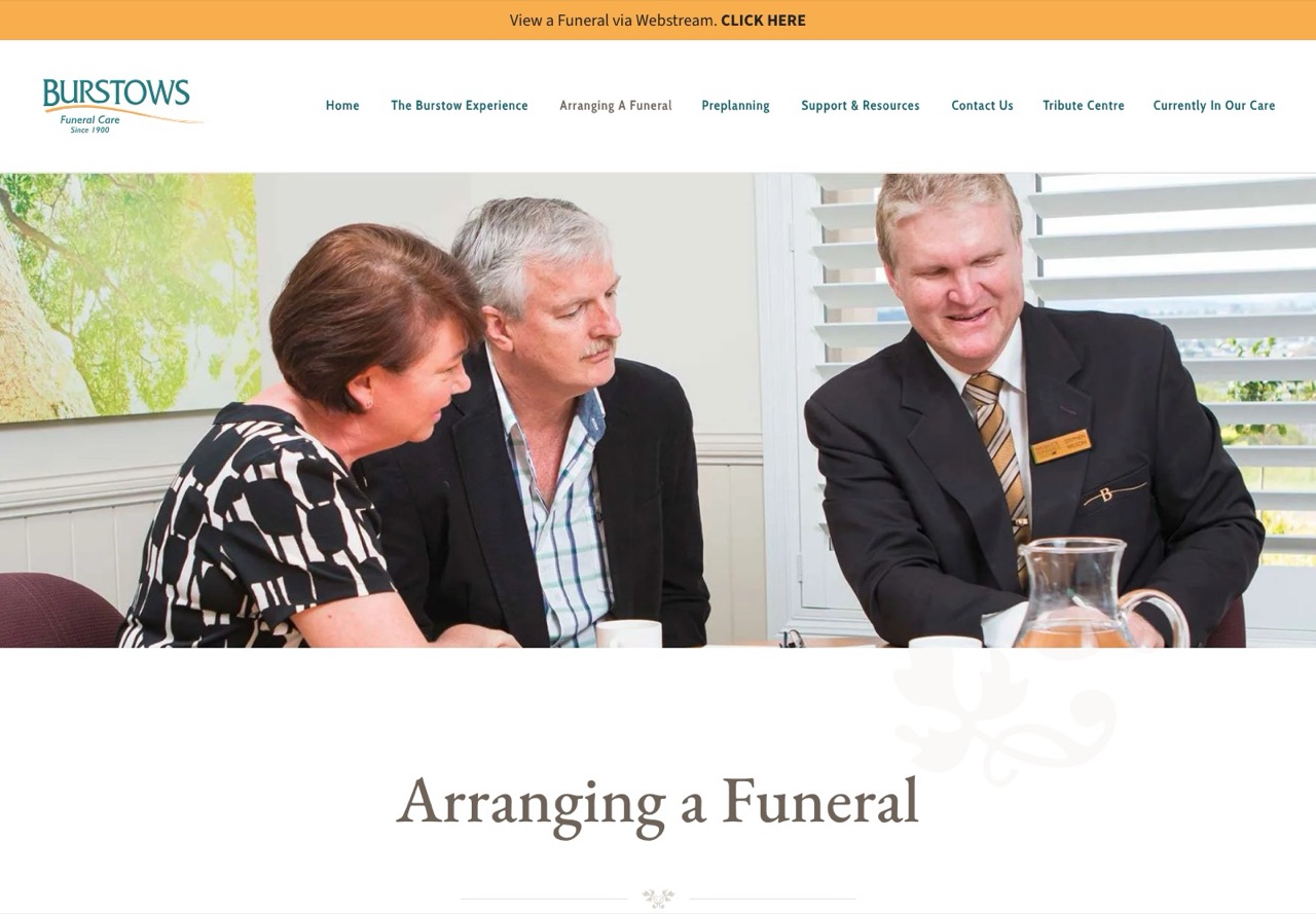
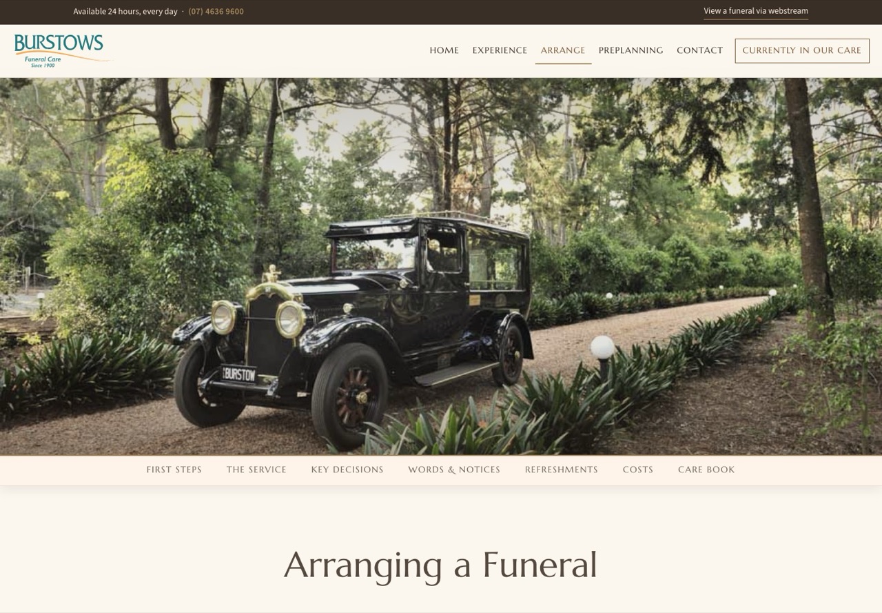
Fifteen guides, from Before Meeting the Funeral Director through to Settling Funeral Expenses, used to be fifteen separate pages under an address that did not match the rest of the site. They are now six stages on one page, with a section bar that stays in view as you scroll and the Complete Care Book beside them. Every old address still works and lands on the right stage.
Services that photograph well
Thirteen services, each with its own page and photograph, reachable in one click rather than through two different menus. Bereavement Support, Webstreaming and the Crematorium each keep their own address, because each one is searched for on its own.
Recruitment that files itself
The old employment address quietly redirects to the homepage, so a candidate who followed it from a job advertisement went nowhere. The new page lists open positions with a simple on and off switch, and the application form saves each candidate into a database rather than an inbox: their name, the positions they are interested in, preferred location, full time or part time or casual, availability, earliest start date, why Burstows, and their CV.
The team then sorts applications by status, new, shortlisted, interviewed, on file or declined, and can filter by position or location when a role opens. This is the recruitment database your team asked for, and it is already built and waiting for its account.
Preplanning that invites a conversation
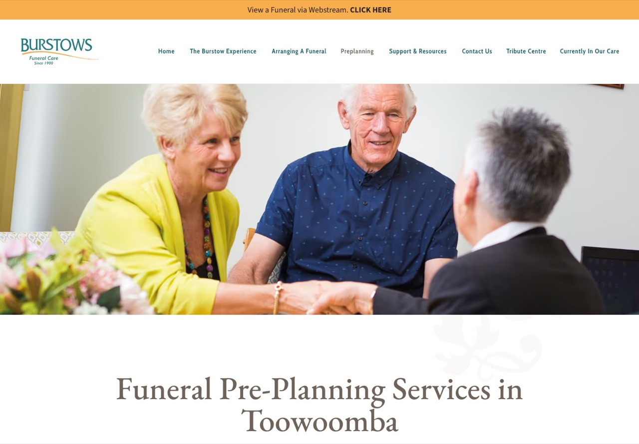
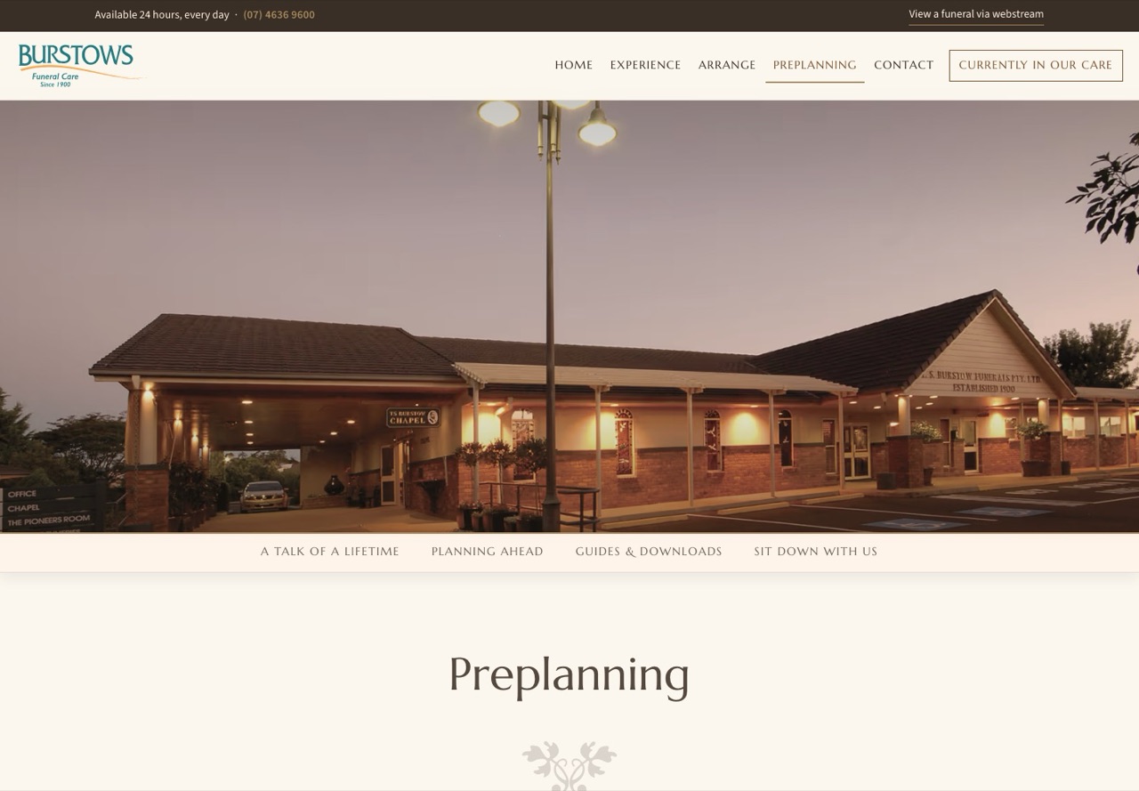
The preplanning page now reads in four parts: A Talk of a Lifetime, Planning Ahead, Guides and Downloads, and Sit Down With Us. The guides are behind a simple email capture, so the team knows who has taken one, and the page ends with an invitation to visit rather than a form.
Contact without the clutter
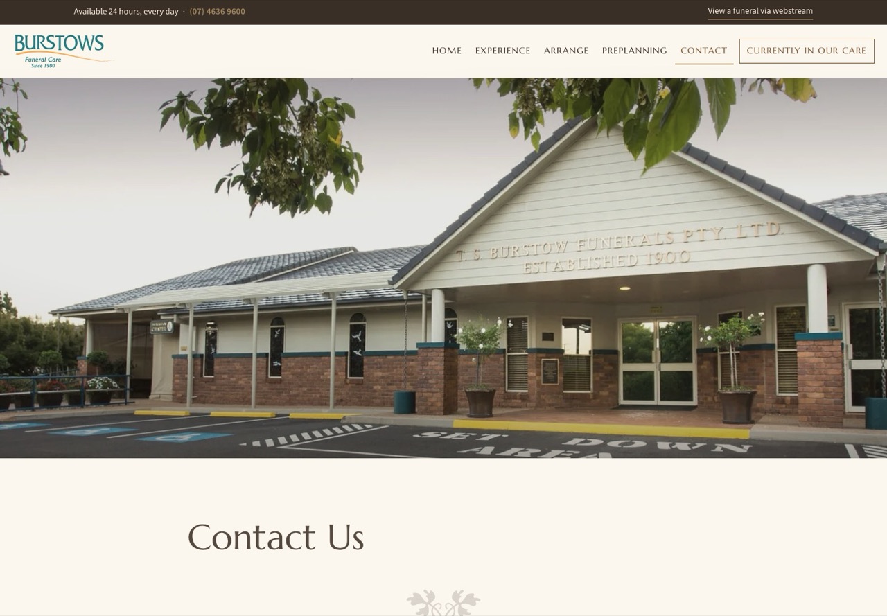
The four homes, the phone number, the after hours line and the form, with Employment and Gifting Back a link away rather than in a dropdown.

News the team can publish
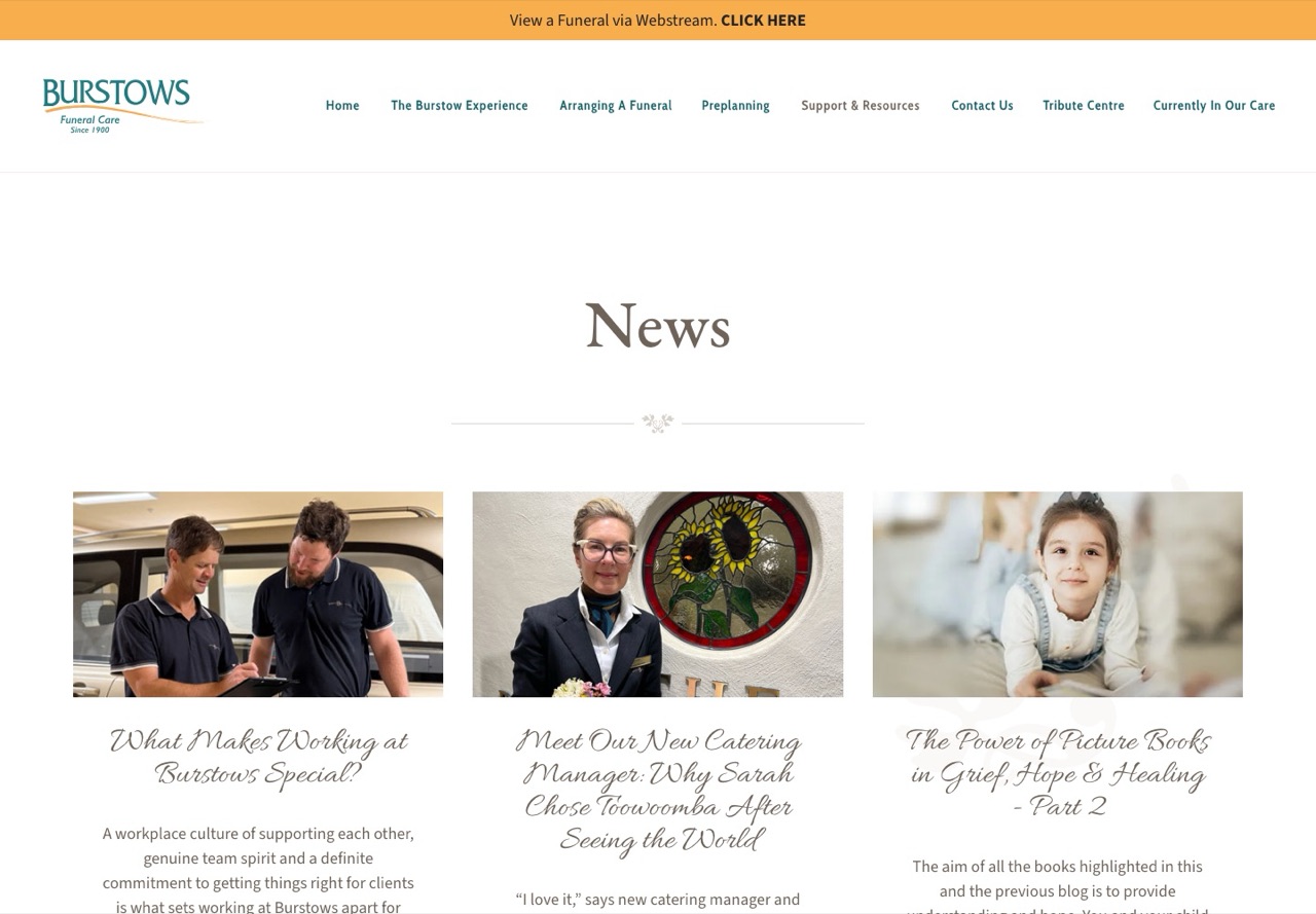
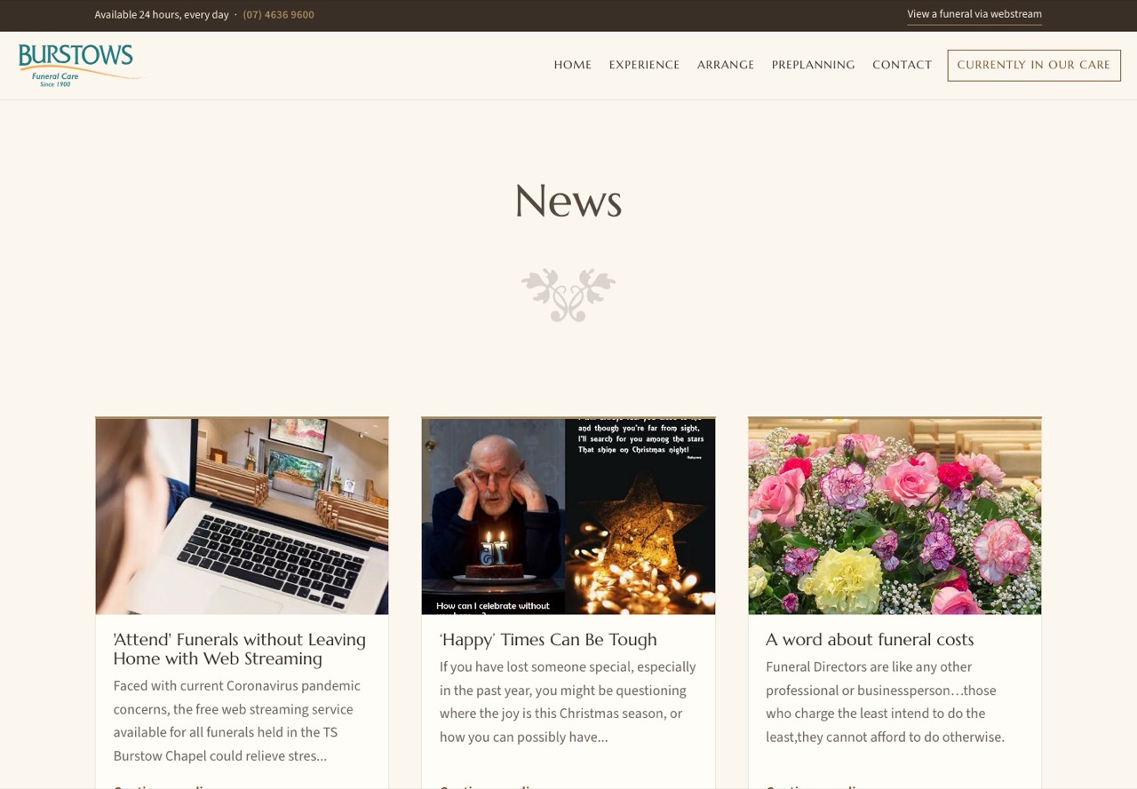
All 26 posts carried across with their photographs. A new post is a record with a title, a date, a picture and the words, not a page to be built. Posts are on the site about a minute after they are published.
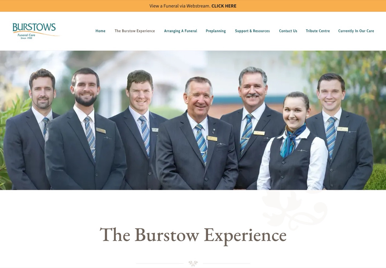
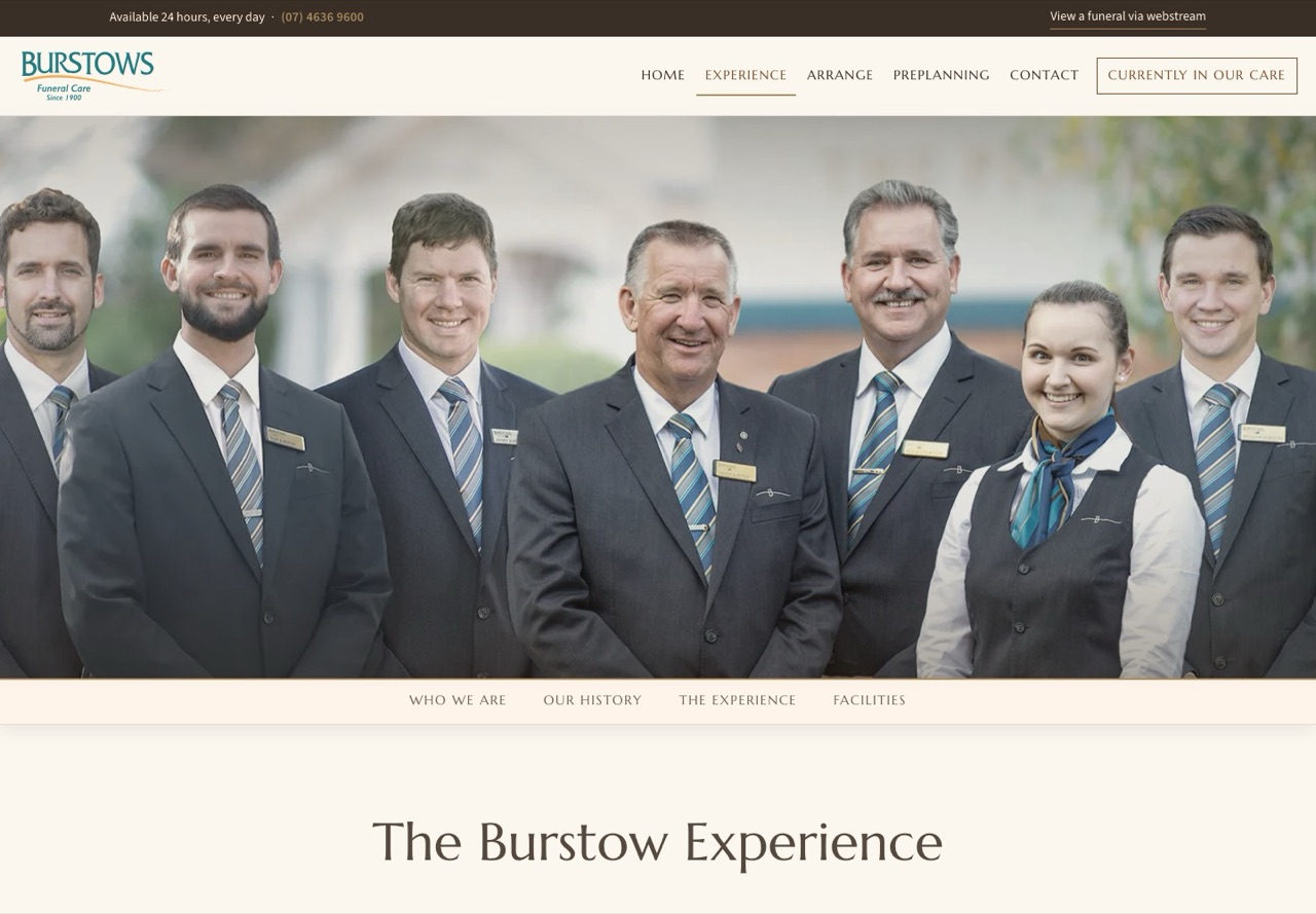
The Burstow Experience in one place
The Philosophy, the History since 1900 and the Facilities were three pages under one dropdown. They are now one page with four sections: Who We Are, Our History as a timeline of the generations, The Experience, and Facilities. The old addresses land on the right section.
The paperwork lives with you
Every PDF on the site, including the Funeral Pricing Information a family downloads from the footer, is now on burstows.com.au. Today those files are on Webflow's servers, at Webflow addresses, and would disappear with the account.
Eighteen measures, side by side
Google's own testing tool, Lighthouse, loads a page the way a mid range phone on a slow connection would and reports eighteen measures. We ran it 3 times on each homepage on 02/09/2026 and took the middle result of each, so a single lucky or unlucky run cannot tip the table. Scores are out of 100 and higher is better. For everything else, lower is better.
| Measure | Current site | New site | Better |
|---|---|---|---|
| Performance score | 64 | 97 | New site |
| Accessibility score | 96 | 100 | New site |
| Best practices score | 100 | 100 | Level |
| Search engine basics score | 92 | 100 | New site |
| First words on screen | 4.3 s | 1.7 s | New site |
| Main picture or heading on screen | 9.0 s | 2.3 s | New site |
| How quickly the page fills in | 5.0 s | 1.7 s | New site |
| Page ready to use | 9.9 s | 6.5 s | New site |
| Time the page is frozen while loading | 46 ms | 68 ms | Current site |
| Worst delay responding to a tap | 111 ms | 140 ms | Current site |
| Content jumping about | 0.016 | 0.000 | New site |
| Total downloaded to show the page | 1,078 KB | 924 KB | New site |
| Separate files downloaded | 66 | 27 | New site |
| Building blocks on the page | 609 | 168 | New site |
| Files that block drawing (time cost) | 300 ms | 150 ms | New site |
| Downloaded code never used | 1 KB | 0 KB | New site |
| Work the phone does to build the page | 0.9 s | 0.4 s | New site |
| Time spent running scripts | 0.4 s | 0.3 s | New site |
The two frozen time rows need a word of explanation, because they look like the one place the current site wins and they are not. Both sites load the same Google Tag Manager container, and its scripts freeze the phone for the same fraction of a second on each. The test only counts freezes that happen after the first words are on the screen. On the current site nothing is on the screen until 4.3 seconds, so the freeze happens in the dark and goes uncounted. On the new site the words are up at 1.7 seconds, so the same freeze is counted against it. The two rows that measure the total work, near the bottom of the table, show the new site doing less of it.
Three things made the difference. The fonts live on the site itself rather than being fetched from Google's servers before anything can be drawn. Every photograph on the homepage is sent at the size a phone will show it rather than at full size. And the tag container waits until the first screen has painted before it loads. On Webflow none of those changes were available to us.
Two things the current site gets wrong, fixed
- The employment address sends people to the homepage. The new site has a real employment page at the same address.
- The homepage tells the browser to fetch a picture that no longer exists, so every visit begins with a failed request. The new site does not.